
Don’t ask us – we don’t know what it means either. But at http://yeroon.net/ggplot2/ you’ll find a wonderful graphical interface to Hadley Wickham’s ggplot2 package. With ggplot you can very easily produce some very sophisticated plots, but there is a lot to learn and the Yeroon site can help you get started.
To give it a try, paste the following into R to produce a data set to work with,
quakes$depth.class <- cut(quakes$depth,4)
levels(quakes$depth.class) <- c("A","B","C","D")
write.csv(quakes,"quakes.csv",quote=F,row.names=F)
This produces the file quakes.csv in your working directory. Next, navigate to Yeroon and
- From the Open Data menu, select Upload File, and import the quakes.csv file we just created.
- In the centre panel,
- Right click, select Map x and choose long
- Right click select Map y and choose lat
- Right click, select Facet then Map and choose depth.class
- Right click, select Add Layer then Bivariate Geoms and choose points
- In the Layers panel on the left, right click on points, select color then Map and choose mag
- From the View menu, tick code panel
- Finally, click the Draw Plot button below the centre panel
In the code panel at the bottom Yeroon gives you the code needed to produce the plot in R
library(ggplot2)
myData <- read.csv("C:\fakepath\quakes.csv", header=T, sep=",", dec=".")
ggplot(myData, aes(x=long, y=lat)) + geom_point(aes(colour=mag)) +
  facet_wrap(~depth.class)
and in the centre panel Yeroon shows the result
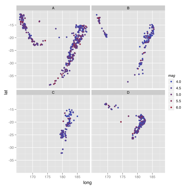
Quakes plot produced by Yeroon